Home > Analysis & Reporting > Creating Dashboards > How is a comparison board different from a dashboard?
Comparison boards let you compare data across multiple data segments, in separate columns. A comparison board can have two, three, or four columns and as many charts as you choose. When you create a comparison board, whatever metrics you choose to display will be automatically mirrored in all of the columns that you configure.
The processes and options for comparison boards are the same as for regular dashboards. You simply define different column filters for the data segments so as to make your data display meaningfully.
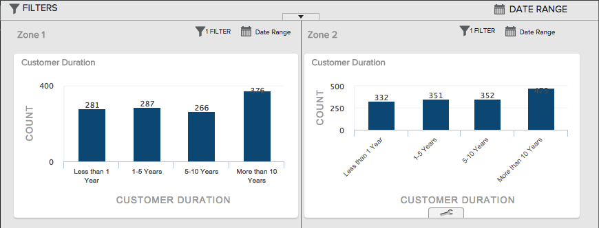
In this example we have created a 2-column comparison board to compare customer duration figures between Phoenix and Los Angeles:
We did this by filtering the left column to only show City = Phoenix, and the one on the right to only show City = Los Angeles.