
Another aspect of controlling how your charts will be displayed in Salesforce is setting numeric values that determine the scale they will use, and also selecting the graph type that will appear. Follow these steps to set these variables:
1. Click on the Configuration tab:
The Configuration page appears:
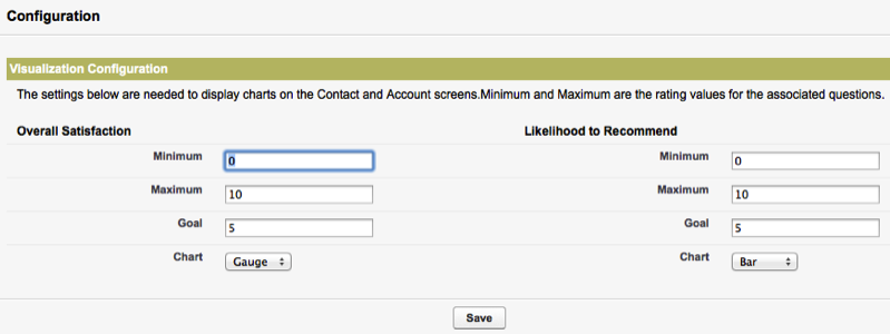
2. Notice that the labels reflect the changes you made when you customized Response field labels, i.e. Key Metric 1 now displays as Overall Satisfaction and Key Metric 2 displays as Likelihood to Recommend.
3. Set the minimum value for Key Metrics 1 and 2 (in this case, Overall Satisfaction and Likelihood to Recommend). A common definition for this is "0".
4. Set the maximum value for Key Metrics 1 and 2 (in this case, Overall Satisfaction and Likelihood to Recommend). A common definition for this is "10".
5. Set the goal for Key Metrics 1 and 2 (in this case, Overall Satisfaction and Likelihood to Recommend). You might select "8", for instance.
6. Use the pulldown menu to make the charts display as either a gauge or a bar.
7. Click Save. Your changes are now ready to appear in the interface. To complete this process, follow the instructions in the section Set up Page Layouts.