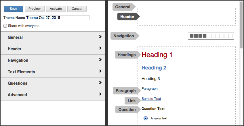
To create a new theme, go to Format | New Theme. To edit an existing one, click on its pencil icon on the Browse Themes page.

Note: When you create a new theme, the name will default to today's date, but you can change it to something more meaningful.
Within the Theme Designer, as you configure each setting on the left you will see the change take place on the right. Be sure to note the checkbox at the top labeled Share with everyone. If you check it, your theme will be available to other survey designers within your organization. If you don't, only you will be able to use it.
Use the different sections of the navigation pane to define your theme as desired:
General settings define the background of the browser page and the survey page, including width, alignment, margins, colors, and images.
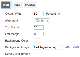
Overall Width - defines the size of the survey page in relation to the browser window. It can be expressed in pixels or a percent of the browser window.
Alignment - positions the survey page within the browser window, i.e. centered, right or left-justified.
Top Margin - the number of pixels between the top of the browser window and the top of the survey.
Left Margin - the number of pixels between the edge of the browse window and the edge of the survey.
Background Color - the background color for the browser window.
Background Image - an image you want to use as the background of the browser window.
Survey Background - the background color of the survey page.
Note: If you choose both a background color for the browser and a background image, the image will override the color.
Use the Tablet and Mobile tabs to control the survey's appearance on those devices. On each of these tabs you can set a pixel size for when the device definition should become active:

Headers allow you to put text or images on every page of your survey without having the copy and paste them on every page. This is usually where you'll put your logo. There are several advantages to using headers:
saves the time it takes to copy/paste on every page
changing the header within the theme settings applies it to all pages
loads once, when the survey is opened. If you copy/paste on every page, the image is loaded every time the respondent opens a new page
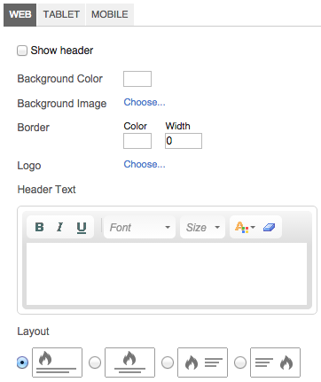
Use this section to control the following aspects of your headers:
Show header - lets you to choose whether you want to use a header. Uncheck the box to turn it off.
Background Color - lets you provide a background color for the header.
Background Image - lets you select an image as the background for the header.
Border - lets you choose a color and width for the border around the header section. If you don't want a border, set the color to match the background color and the width to 0.
Logo - lets you choose your logo. You can set the dimensions of the logo when you import it; the file size must be no more than 4MB.
Header Text - lets you specify text for the header. Use the html formatting toolbar to format the text.
Layout - lets you choose where the logo and text are displayed relative to the page and each other.
Use the Tablet and Mobile tabs to control the header's appearance on those devices.
You can choose to put a navigation bar at the top of your survey, the bottom, or both. If you choose to use both, they can also be configured differently. For example, you may want your Back and Next buttons at the bottom, but the progress bar at the top.
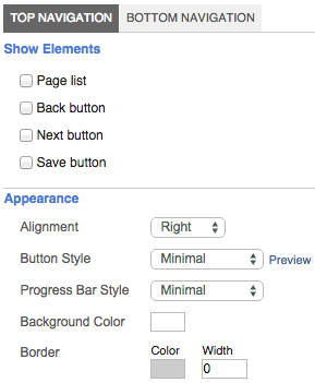
Page list - displays a drop-down list of survey pages that allow the respondent to jump from page to page. Your survey rules, such as required fields and branching, will always be enforced. Even if you choose not to use the page list when you deploy your survey, it's a handy way to test specific pages as you build your survey.
Back button - lets you choose whether you want to put a back button on your survey. Some designers don't want respondents to go back and change their answers once they've moved forward through the survey.
Next button - displays the next button for users to move forward through the survey. In addition, clicking Next also submits the answers on the current page so the system can enforce rules such as requiring that questions be answered.
Save button - this button lets the user save their responses as they fill out the survey so they can come back later and start where they left off.
Alignment - lets you decide whether the elements on the navigation bar are centered, left-, or right-justified.
Button Style - lets you choose from several system-defined button styles. You can click the Preview link to view the selections.
Progress Bar Style - lets you choose from several system-defined styles for the progress bar. Select None if you don't want to display a progress bar.
Background Color - lets you select a colored background for the navigation bar.
Border - lets you choose the color and width for the border, if you choose to use a border.
Text elements refer to any place in the survey that uses descriptive text. Don't confuse text elements with the text you use inside of questions or tables. Instead, this is text that is used for headings, labels, instructions, disclaimers, etc. The object is referred to as Descriptive Text when you add it from the Insert menu. There are three tabs:
Headings - defines formatting for Heading 1, Heading 2, and Heading 3 text
Paragraph - defines formatting for paragraph text, such as instructions or introductions
Link - defines formatting for text that is hyperlinked to other survey pages or websites
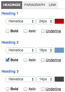
Click each tab and configure the formatting for each text type.
The Questions setting lets you define the style for questions, including question and answer text formatting, background colors and banding for alternate rows.
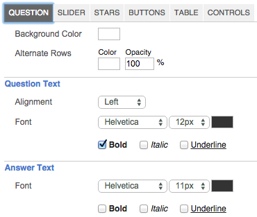
Background Color - the background color of the answer set.
Alternate Rows - the color you want to apply to alternate rows for banding. If you don't want to use banding, set the background color and alternate row color the same.
Opacity - determines the amount of transparency of the alternate row color. 0% is fully transparent so the alternate color doesn't show at all. 100% is completely opaque so the exact color you select for the alternate rows displays. Any value in between determines how much of the background color shows through the alternate color.
Question Text Alignment - lets you choose to center, left- or right-justify the question text in relation to the answer set
Question Font - lets you choose the font family, size, and color of the font, as well as the style, such as bold, italics, and/or underlined for question text
Answer Font - lets you choose the font family, size, and color of the font, as well as the style, such as bold, italics, and/or underlined for answer text
Additional tabs allow you to define the style of your various question types:
Slider - This tab lets you define your Background Color, Handle Color, and Selected Color.
Stars - On this tab you can use a dropdown menu to select between various star styles.
Buttons - This tab allows you to specify font style and colors for your buttons.
Table - This tab lets you define how table questions will appear in your theme. Read about it here.
Controls - This tab lets you define how radio buttons and checkboxes will appear in your survey.
Table settings let you define the style for tables, including question and answer text formatting, background colors, and banding for alternate rows and headings.

Border - defines the border around the outside the tables as well as between rows and columns. Specify the color and size of the border (in pixels).
Background Colors Header - lets you set background colors for the header row. You can specify the same or different colors for the question text (first column) and the answer text (all other columns).
Background Colors Rows - lets you specify the background color for the rows of the table, excluding the header row.
Background Color Alternate Rows - lets you specify the background for alternate rows for banding. If you don't want bands of color, just set both colors the same.
Background Color Opacity - determines the amount of transparency of the alternate row color. 0% is fully transparent so the alternate color doesn't show at all. 100% is completely opaque so the exact color you select for the alternate rows displays. Any value in between determines how much of the background color shows through the alternate color.
Fonts Table Font - specifies font settings for the upper, left cell of the table. This may contain the table description. You have the option of checking or unchecking the "Display description above table". If you leave it checked the description goes above the table and uses the text elements setting. If you uncheck it, the description goes in the upper, left cell and uses the Table Font settings.
Fonts Table Alignment - controls the positioning of text in the upper, left cell. The first drop-down lets you select center, left- or right-justified. The second drop-down positions the text at the top, middle, or bottom of the cell.
Fonts Question Font - specifies font settings for question text. Questions represent the rows in the table, so question text is text in the first column, excluding the upper, left cell.
Fonts Question Alignment - controls the positioning of text in the first column, excluding the upper, left cell. The first drop-down lets you select center, left- or right-justified. The second drop-down positions the text at the top, middle, or bottom of the cell.
Fonts Answer Font - specifies font settings for answer text. Answers represent the columns in the table, so answer text is text all columns other than the first column, excluding the header row.
Fonts Answer Alignment - controls the positioning of text in all columns other than the first column, excluding the header row. The first drop-down lets you select center, left- or right-justified. The second drop-down positions the text at the top, middle, or bottom of the cell.
In addition to the styling that is built into the definition of a theme, you can also write CSS (cascading style sheet) code to further customize the look and feel. For example, if you want to create a different style for the buttons on your navigation bar, you could write CSS to do that. Although you can write the CSS yourself, MaritzCX doesn't support customer-written CSS. Talk to your account representative to discuss options for having MaritzCX provide CSS code.