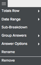
The drop-down menu for breakdowns provides you with options for customizing your breakdowns (x-axis). The options you see may differ depending on the type of chart you create. As we did for metrics, let’s talk about sorting first.
Just as you can sort by metric value, you can also choose to sort by the breakdown. Obviously, you have to choose one or the other; you can’t sort by two different values at the same time. In the case of a breakdown, the sort is alphabetical rather than numerical.
When you hover your mouse over a breakdown, arrows appear that allow you to choose an ascending or descending sort.
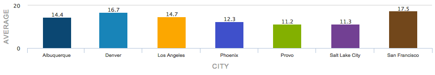
This is an example of a breakdown by city, sorted in ascending alphabetical order:
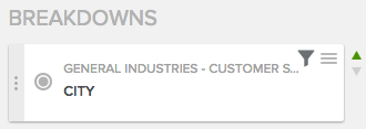
To open the Breakdown menu, click the pancake menu next to a given breakdown:
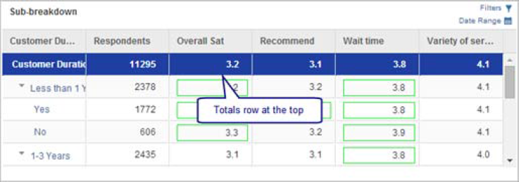
In tables, you can choose to add a row that displays totals. You can choose to display it at the top or bottom of the table as well as define the font characteristics to set it apart from the rest of the table.
This table shows the total row at the top with a blue background and white text.
You can also apply date range filters at the metric level as well as several other levels. We explain date range filters in their own topic.
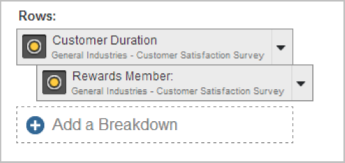
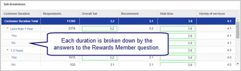
In tables, you can choose to add a sub-breakdown which allows you to show the relationship between two questions. In this case, "Rewards Member" has been used as a sub-breakdown of "Customer Duration", as indicated by the indentation.
As you can see in the following chart, each answer to the customer duration question shows the breakdown of that answer by whether the respondent answered yes or no to the rewards member question:
You can group answers to create subtotals. This lets you ask you questions at a very specific level and then roll them up for reporting. Once you’ve created groups, you can turn them on and off to provide flexibility in how you view the data.
Consider this chart:
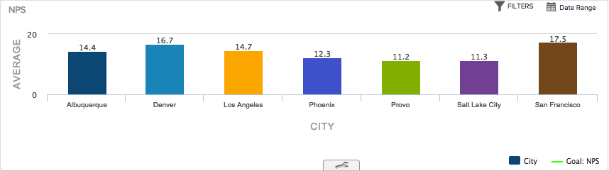
In this example we will create a group for Utah cities:
1. Open the toolbox for your chart:

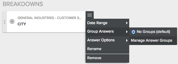
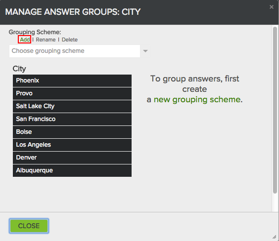
2. Select Pancake Menu | Group Answers | Manage Answer Groups.
3. Click Add to create a new grouping scheme.
4. In the Grouping Scheme field, name the scheme.
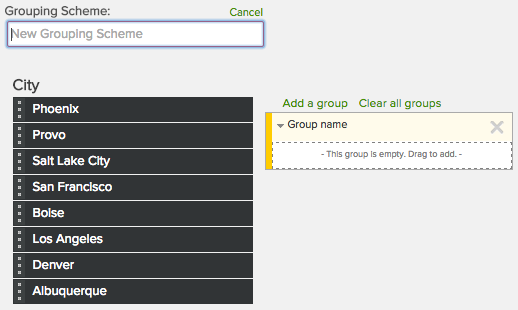
5. Click the field marked Group name and name the first group "Utah".
6. Drag each Utah city into the group.
7. Continue adding as many groups as you need.
8. Click Close.
Answer options allow you to do several things, including creating a manual order that overrides any other sort order you’ve defined, hide specific answers and choose the number of values you want to display.
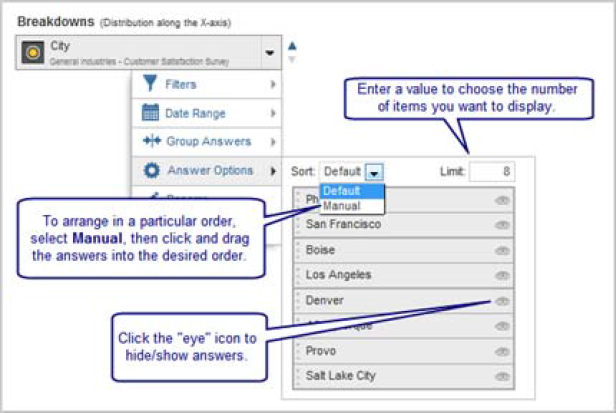
By sorting in ascending or descending order and then using the limit field, you can create a chart that always shows “Top x values” or “Bottom x values”.
Rename allows you to change the name of the breakdown so you can control the labels used on your chart.
Remove lets you remove a breakdown from the chart. You can also simply click and drag the breakdown off of the chart.